Neutral Colour Palettes That Never Go Out of Style
Interior design trends may come and go, but neutral colour palettes continue to remain a timeless favourite among homeowners and designers alike. Their versatility, elegance, and ability to create a calming atmosphere make them a foundation for beautiful interiors that stand the test of time.
Whether you're designing a new home or refreshing an existing space, neutral tones offer the perfect balance of sophistication and flexibility.
Why Neutral Colours Remain Timeless
Neutral shades create a sense of harmony that works across different design styles from contemporary and minimalist to classic and luxurious. Unlike bold colour trends that can feel dated after a few years, neutrals provide a lasting backdrop that evolves effortlessly with changing décor and personal preferences.
They also help spaces feel brighter, larger, and more welcoming, making them ideal for modern homes
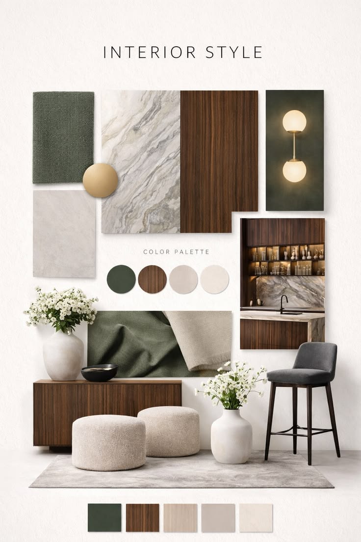
The Most Timeless Neutral Palettes
1. Warm Beige & Ivory
A combination of soft beige and creamy ivory creates a cozy, inviting environment. These tones add warmth without overwhelming a space and pair beautifully with natural wood finishes, textured fabrics, and subtle metallic accents.
Best for: Living rooms, bedrooms, and family spaces.
2. Greige (Grey + Beige)
Greige combines the sophistication of grey with the warmth of beige, making it one of the most versatile neutral shades available today. It works seamlessly in both modern and traditional interiors.
Best for: Open-plan living spaces and contemporary homes.
3. Soft White & Natural Wood
A crisp white palette complemented by natural wood textures creates a clean, airy aesthetic. This combination embraces simplicity while maintaining warmth and character.
Best for: Scandinavian-inspired and minimalist interiors.
4. Taupe & Stone Grey
Taupe and stone grey offer a refined, luxurious appearance without feeling cold. Together, they create depth and sophistication while remaining understated.
Best for: Master bedrooms, formal living rooms, and luxury residences.
5. Sand, Cream & Earthy Accents
Inspired by nature, this palette combines sandy neutrals with soft creams and earthy textures. The result is a tranquil environment that feels grounded and timeless.
Best for: Homes seeking a warm, organic aesthetic.
How to Keep Neutral Interiors Interesting
A neutral palette doesn't mean a boring space. The secret lies in layering textures, materials, and finishes.
Consider incorporating:
Natural wood elements
Textured fabrics and upholstery
Stone and marble surfaces
Metallic accents
Statement lighting
Indoor plants and greenery
These elements add visual interest while maintaining the calm elegance that neutrals provide.
The Timberlane Approach
At Timberlane, we believe timeless interiors are built on thoughtful design choices rather than short-lived trends. Neutral colour palettes serve as the perfect canvas for creating spaces that feel elegant today and remain relevant for years to come.
By combining carefully selected colours, premium materials, and personalized design solutions, we craft homes that are both beautiful and enduring.
A well-designed neutral palette is more than a colour choice, it's an investment in timeless living. Whether you prefer warm beiges, sophisticated greys, or crisp whites, neutral interiors offer unmatched versatility and longevity.
When paired with quality materials and thoughtful design, these palettes create homes that never go out of style.
Ready to Design a Home That Feels Like You?
Connect with Timberlane today and let us transform your vision into a beautifully designed living experience.
Start Your Journey